Now with genuine color!

Tuesday, July 27, 2010

Ok, so now I have actually put real color on this thing. I think it has come out pretty well, but I still have the issue of space. Space needs to be carefully regulated. Especially when you're like me and use a lot of negative space in compositions.

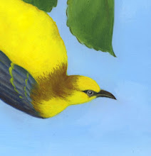
This time I have decided to use a bit of an unorthodox approach. I think, after playing around with it on the computer a bit, that I am going to make this a square painting. Usually, paintings have a rectangular shape. This lends a picture an automatic sense of direction. A picture that is symmetrical along both axes is unusual because it is harder for the viewer to orient him/herself.

This, however, seems to be one of those rare cases where an obvious directional cue is a perfect fit. Everything will be floating in this piece if it is square, but it should be appropriate rather than disorienting. Still, I wouldn't mind hearing a few opinions, so please take a gander at the proposed shape (above) and let me know what you think. Other possible shapes are below. Which works best?


very wide

wide

Just one of my colorful little musings

Tuesday, July 20, 2010

Just keeping it light this week I haven't mounted this yet, so it still looks wrinkly. But I'm a wrinkly sort of person, I guess ^^

Working the pen angle

Tuesday, July 13, 2010

So I am still finding a little time to work on painting in between sessions of tearing out drywall at my brother's new old house. I am trying to go in new directions now that I feel I have some sort of grasp of the basics.
Currently, I am working on this piece, a moon-winged butterfly. 
One of the interesting aspects of this is getting to use my new mouse pen & and drawing tablet on the computer.
I have a bad record of taking things from black and white to color, and I think this new tool is going to really get me over that. Using the pen, I can now add color to my work without ruining it in the process. I can preview color combinations much more easily and reliably than in my head.
Here's an example with this painting. The lower left leaves were done with a mouse and the butterlfy with the pen. You can see to difference in the accuracy and smoothness of the line. And it was faster, too!
I feel much more confident about painting color on top of my ink work now.
I am also using the pen to brainstorm adding some more leafy elements to the foreground. What do you think - is it better to leave the landscape very ope, or frame it with more plants?

Shocking update

Thursday, July 1, 2010

Altho in reality the only thing shocking about this is that I'm doing two posts in one week. Must be a sign of the apocalypse. So, does the girl look girly enough now?

Visit me on Etsy

 
ZephiArt. Design by Pocket