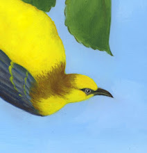
This time I have decided to use a bit of an unorthodox approach. I think, after playing around with it on the computer a bit, that I am going to make this a square painting. Usually, paintings have a rectangular shape. This lends a picture an automatic sense of direction. A picture that is symmetrical along both axes is unusual because it is harder for the viewer to orient him/herself.
This, however, seems to be one of those rare cases where an obvious directional cue is a perfect fit. Everything will be floating in this piece if it is square, but it should be appropriate rather than disorienting. Still, I wouldn't mind hearing a few opinions, so please take a gander at the proposed shape (above) and let me know what you think. Other possible shapes are below. Which works best?
 |
| very wide |
 |
| wide |


1 comments:
Post a Comment